What Is UI/UX Design and Why Does It Drive Conversions?
UI (User Interface) and UX (User Experience) are related but distinct disciplines. UX shapes the overall experience: how easy, intuitive, and satisfying it is to accomplish a goal. UI shapes the visual presentation, layout, typography, colour, and interactive elements.
Together, they determine whether a visitor stays or leaves. Every friction point is a potential conversion lost. Forrester Research found that a well-designed UX can raise conversion rates by up to 400% and deliver $100 for every $1 invested.
"Design is not just what it looks like and feels like. Design is how it works, and how well it converts." Cinovic UX Practice
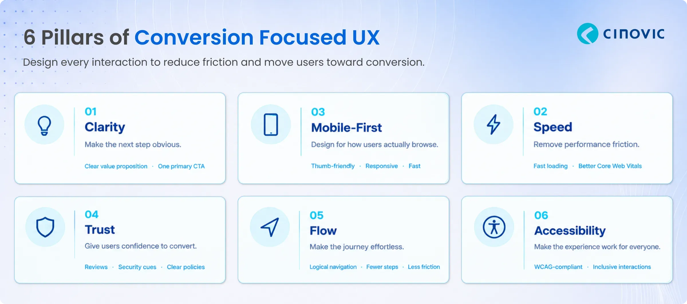
The 6 Pillars of Conversion-Focused UX Design
Effective conversion UX is built on six interconnected pillars. Any weakness creates a leak in your funnel.
Understanding the Conversion Funnel Through a UX Lens
Every user journey maps to a funnel, and every stage has distinct UX requirements. Conversion problems are almost always localised to one or two stages; identifying which is the first step to fixing them.
Awareness & First Impression
|
|
|
|
|
|
|
|
|
|
|
|
|
|
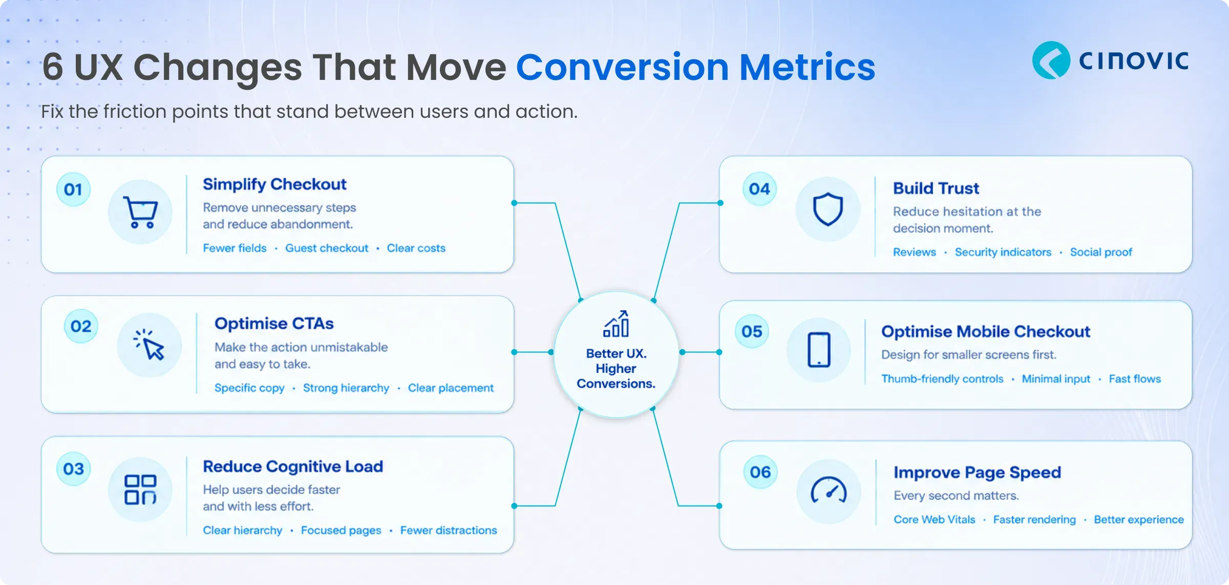
High-Impact UX Changes That Move Conversion Metrics
Not all UX improvements are equal. These changes consistently produce the largest measurable conversion impact.
1. Simplify and Streamline Checkout
2. Optimise CTAs (Call-to-Action)
CTA design is one of the highest-leverage micro-improvements in conversion. Button copy, colour, size, and placement all affect click rates. "Start Your Free Trial" outperforms "Sign Up". Specific, action-forward copy converts more reliably.
3. Reduce Cognitive Load on Key Pages
Pages overloaded with competing messages force users to work harder, and users who have to work hard simply leave. Good UX creates visual hierarchy that guides attention naturally to the conversion action.
4. Design for Trust at the Decision Moment
The moment of conversion is the moment of maximum hesitation. Trust signals, reviews, security indicators, money-back guarantees, and social proof directly address psychological barriers. Nielsen research shows 88% of consumers trust online reviews as much as personal recommendations.
5. Mobile Checkout Optimisation
Mobile conversion rates are consistently lower than desktop despite mobile commanding the majority of traffic. The gap is almost entirely a UX problem: small tap targets, slow loads, and flows designed for mouse and keyboard.
6. Improve Page Load Speed
Speed is UX. Google's Core Web Vitals framework defines the performance metrics that most directly impact user experience: LCP, FID, and CLS. Improving these metrics improves both search rankings and conversion rates simultaneously.
Good UX vs Poor UX: The Business Impact
The difference between good and poor UX is not aesthetic — it is commercial.
|
|
|
|
|
|
✘ Confusing layout, slow load
|
✓ Clear value prop, fast render
|
|
|
|
✓ Intuitive, always findable
|
|
|
✘ Vague info, poor imagery
|
✓ Rich content, clear pricing
|
|
|
✘ 7+ steps, forced sign-up
|
✓ Guest checkout, 3 steps
|
|
|
✘ Pinch to zoom, tiny CTAs
|
|
|
|
|
✓ Social proof, security cues
|
|
|
|
✓ Engaged users, higher AOV
|
UX Design Specifically for Ecommerce Conversions
Ecommerce UX has distinct requirements driven by the psychology of online purchasing. These elements consistently deliver the highest conversion impact in commerce contexts.
Conversion-Critical Ecommerce UX Elements
Where ecommerce UX investment delivers the highest measurable return.
|
Product photography and video: High-quality multi-angle images and video reduce purchase hesitation and return rates. They are the digital substitute for the in-store touch experience.
|
Search and filtering UX: Users who use site search convert at 2-3× the rate of those who don't. Search relevance, speed, and filter design are among the highest-ROI UX investments.
|
Persistent cart and wishlist: Saving cart contents across sessions prevents purchase intent from expiring. Wishlist functionality creates return visit intent and enables retargeting.
|
One-page or step-by-step checkout: Visible progress indicators reduce anxiety and drop-off. Each form field removed from checkout measurably increases completion rates.
|
Real-time inventory and urgency cues: "Only 3 left" and "Order in 2 hours for same-day delivery" create urgency grounded in fact, not manufactured scarcity.
|
Post-purchase experience design: Confirmation emails, order tracking, and returns directly influence repeat purchase rates and NPS. Most brands neglect this entirely.
|
Cinovic's UX Design Process for Conversion
Great conversion UX is not guesswork; it is a structured process of discovery, hypothesis, design, and validation.
-
Analytics & Funnel Analysis: Map the current user journey using analytics — identify where users drop off, which pages have high exit rates, and where hesitation occurs. Data locates the problem before design solves it.
-
UX Audit: Evaluate the existing interface against usability heuristics, WCAG 2.1 accessibility standards, Core Web Vitals, and conversion best practices. Produce a prioritised issue list ranked by estimated conversion impact.
-
Wireframing & Prototyping: Low-fidelity wireframes establish layout and flow, then interactive high-fidelity prototypes in Figma. Prototypes let stakeholders experience the design before development begins.
-
Usability Testing & Iteration: Test prototypes with real users. Identify friction that design assumptions missed. Iterate before handing to development. Each iteration round significantly reduces the cost of post-launch fixes.
-
A/B Testing & Measurement: Launch changes with rigorous A/B tests (Google Optimize, Optimizely, VWO) that compare conversion rates with statistical confidence. Let data validate design decisions.
Case Study: Fixing Mobile Speed and Cart Friction on a Fashion Storefront
Cinovic's work for a fashion and apparel retailer shows how much of conversion is a UX and speed problem. The retailer's Magento 2 store ran on the legacy Luma theme, whose heavy JavaScript and CSS slowed mobile pages, where most of its shoppers browse. Cart and checkout relied on full page reloads, which added friction at the final step and contributed to cart abandonment.
Cinovic rebuilt the storefront on the lightweight Hyvä theme with Alpine.js and Tailwind CSS, and rebuilt the cart, mini-cart and checkout as AJAX-first interactions so the page no longer reloads at the moment a customer decides to buy. Interactive size and colour swatches and a size-guide overlay cut down on variant confusion, and CMS-driven campaign blocks let the marketing team launch promotions without waiting for developers.
• Faster mobile pages: Hyvä's lighter footprint significantly cut JavaScript and CSS payload versus the legacy theme.
• Lower cart abandonment: AJAX-based cart and checkout removed reload friction at key drop-off points.
• Stable during sales: Caching and lazy-loading kept the storefront responsive during peak traffic.
• Fewer size-related returns: The size-guide overlay and clearer variant swatches reduced sizing mistakes.
Read the full story: Hyva Storefront for a Fashion & Apparel Retailer.
Common UX Mistakes That Kill Conversions
-
Neglecting post-conversion experience: Confirmation pages, onboarding flows, and transactional emails drive repeat purchases and lifetime value, yet most teams treat them as afterthoughts.
How Cinovic Designs for Conversion
Cinovic's design practice is built around one metric: did the design move the conversion needle? We combine UX research, UI craft, and data analytics to create digital experiences that perform — not just impress.
We have designed and optimised ecommerce experiences on Magento and Shopify, SaaS product interfaces, B2B portals, and mobile applications — always starting with data and ending with measurable results.
Conclusion: Design Is a Revenue Strategy
UI/UX design is not a cost centre; it is one of the highest-return investments a digital business can make. The same traffic, converted at a higher rate, is more revenue without more ad spend. The same product, presented more clearly, is more purchases without more inventory.
Stop losing conversions to friction you haven't noticed. Start designing every interaction to move users closer to yes.